• Welcome to Autism Forums, a friendly forum to discuss Aspergers Syndrome, Autism, High Functioning Autism and related conditions.

    Your voice is missing! You will need to register to get access to the following site features:
    • Reply to discussions and create your own threads.
    • Our modern chat room. No add-ons or extensions required, just login and start chatting!
    • Private Member only forums for more serious discussions that you may wish to not have guests or search engines access to.
    • Your very own blog. Write about anything you like on your own individual blog.

    We hope to see you as a part of our community soon! Please also check us out @ https://www.twitter.com/aspiescentral

New Logo

Momo

Well-Known Larrikin
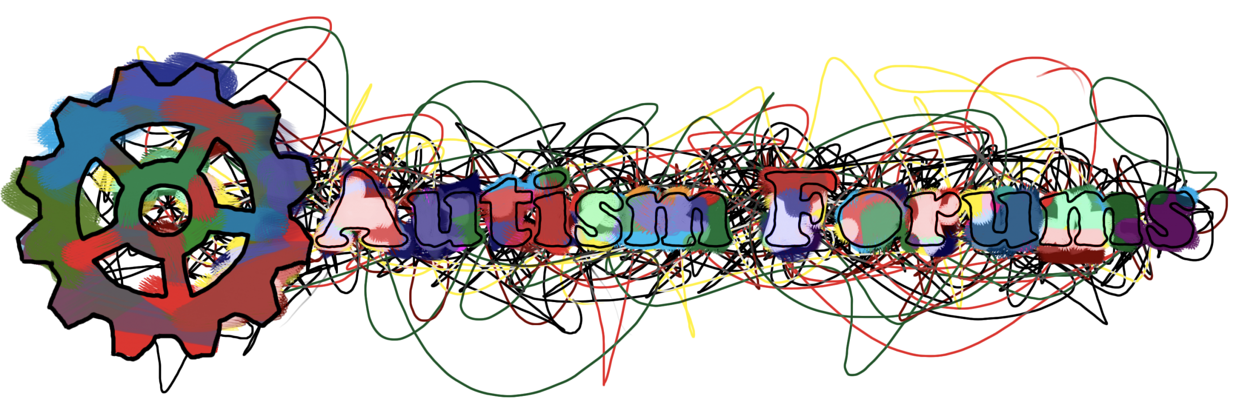
As I'm in the mood to donate my photoshopping skills today, and I really love these forums. I've had a crack at making the new Autism Forums logo, keep in mind this probably isn't very good, and yes you may laugh at my horrible attempt at logo making. I did try though. :D
Read down further to see my newest disastrous attempts!
Autie Forum.png
 
Last edited:
The puzzle piece metaphor is rather controversial. I also think the motley colour scheme of many autism logos is rather infantilizing, creating the image that autism is strictly a children's issue or that people with autism are "like children".

For what it's worth, I kind of like the coloring outside of the lines.
 
I don't like the puzzle piece personally. I find the colours a bit...in your face, but then I'm not one for bright colours :p
 
The puzzle piece metaphor is rather controversial. I also think the motley colour scheme of many autism logos is rather infantilizing, creating the image that autism is strictly a children's issue or that people with autism are "like children".

For what it's worth, I kind of like the coloring outside of the lines.
Whoops. I suppose I could try a different scheme. I just thought the puzzle thingy looked cool, I didn't realise it was controversial. Sorry.
 
I don't like the puzzle piece personally. I find the colours a bit...in your face, but then I'm not one for bright colours :p
Do you have any idea what I should use instead of a puzzle? I'm just asking so I can improve on my next photoshop disaster...
 
I did a google search for "autism symbols" 99% of them incorporate that puzzle peice idea. This site summarizes it's origins and reaction: The Autism Puzzle Piece A Symbol That's Going to stay or go? | The Art of Autism a bit long but worth the read. It also presents some alternative symbols for autism. If we wanted to use one of these Brent would probably have to ask permission, I like this one a lot:

NewAutismsymbol.jpg


and this one:

JamesMccue.jpg


Though the 2nd would probably not work as a "front page/top of page" thing.
 
I did a google search for "autism symbols" 99% of them incorporate that puzzle peice idea. This site summarizes it's origins and reaction: The Autism Puzzle Piece A Symbol That's Going to stay or go? | The Art of Autism a bit long but worth the read. It also presents some alternative symbols for autism. If we wanted to use one of these Brent would probably have to ask permission, I like this one a lot:

NewAutismsymbol.jpg


and this one:

JamesMccue.jpg


Though the 2nd would probably not work as a "frontpage/top of page" thing.
Thank you. That helps a lot.
 
Here's my second and third attempt after taking your input. I wasn't sure if the scribble was too much, I was thinking I might just do the scribble in black... I thought the cog would be a good idea with all the colours because when I was thinking about thinking, I thought of a cog, so there, cogs. :D
 
Personally I prefer the use of the infinity symbol with a rainbow effect.

To symbolize and project the social and political advancement of autistic people by and for autistic people rather than "well-meaning" neurotypicals.
 
Personally I prefer the use of the infinity symbol with a rainbow effect.

To symbolize and project the social and political advancement of autistic people by and for autistic people rather than "well-meaning" neurotypicals.
My only thoughts was if that would be copyrighted or not? Also just trying to think of something different is all, especially after my jigsaw disaster...
 
Do you have any idea what I should use instead of a puzzle? I'm just asking so I can improve on my next photoshop disaster...

I like the infinity symbol. I do really like this one though:

39399_90b8d1e434ce3b54b26ec91fe784c70a.png


I like how you kept the colourful nature of your original, but they're a lot more muted.
 
My only thoughts was if that would be copyrighted or not? Also just trying to think of something different is all, especially after my jigsaw disaster...

To my knowledge this symbol was released into the public domain and is subsequently not copyrighted.
 
I like the infinity symbol. I do really like this one though:

39399_90b8d1e434ce3b54b26ec91fe784c70a.png


I like how you kept the colourful nature of your original, but they're a lot more muted.
Can hardly read it... a logo should be quite plain and preferably only with three colours/colors. Good effort, though.
 
Can hardly read it... a logo should be quite plain and preferably only with three colours/colors. Good effort, though.

I find it easy to read, but I can see what you mean. Especially for people with vision problems, it would be an issue.
 
I find it easy to read, but I can see what you mean. Especially for people with vision problems, it would be an issue.
So perhaps I should make the scribble monochrome? On to the fourth attempt. :D
 
Last edited:
The rainbow sideways infinity symbol has been the recognizable symbol for the neurodiversity movement. I like that one best.
 
The rainbow sideways infinity symbol has been the recognizable symbol for the neurodiversity movement. I like that one best.

That it is a recognizable symbol of a 'movement' may mean using it would be making an unintended political/social statement?
 

New Threads

Top Bottom