ksheehan88
:)

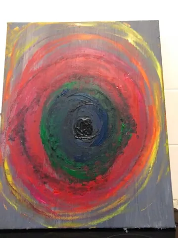
Its a visual representation of emotions, as I interpret them.
The bright colours, yellow and orange, which are thinner and more spread out, are representative of the positive emotions - joy and calm.
The reds and pinks indicate love, lust, passion and anger. These are closer together and thicker.
The greens and blues are jealousy and sadness, you see they are almost lost in the black? The black is the eye of the vortex. Its despair and hate.
Black invades the other emotions - not a lot, but enough, you see?
All of this craziness is on a background of grey. This is because all of these things have grey areas. There is no black and white, no straight lines.
Emotions are like this vortex. Its easy to be at the top, in the yellows and oranges and pinks - but the further you in get, the harder it is to get out.