Pantone colours are very familiar to me especially as an artist. When you print art, or create art for printing even digitally you choose the colour spectrum system you're going to use. Pantone is one of the colour systems, as is RGB and CMYK. Adobe photoshop and corel uses the pantone system and others.
History of Pantone:
Pantone began in New York City in the 1950s as the commercial
printing company of M & J Levine Advertising. In 1956, its founders, advertising executives brothers Mervin and Jesse Levine, hired recent
Hofstra University graduate
Lawrence Herbert as a part-time employee. Herbert used his chemistry knowledge to systematize and simplify the company's stock of
pigments and production of colored
inks; by 1962, Herbert was running the ink and printing division at a profit, while the commercial-display division was $50,000 in debt; he subsequently purchased the company's technological assets from the Levine Brothers for $90,000 (equivalent to $5,740,000 in 2017) and renamed them "Pantone".
[3]
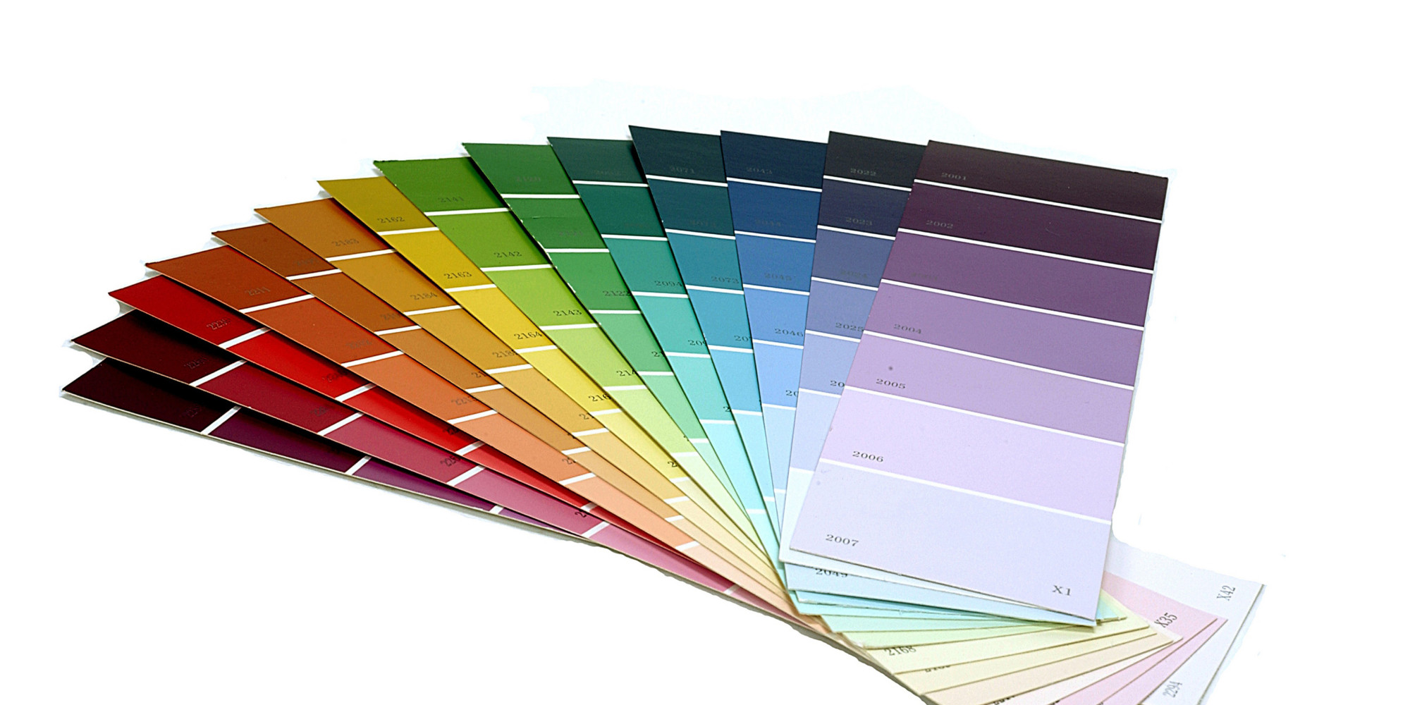
The company's primary products include the Pantone Guides, which consist of a large number of small (approximately 6×2 inches or 15×5 cm) thin
cardboard sheets, printed on one side with a series of related
color swatches and then bound into a small "fan deck". For instance, a particular "page" might contain a number of yellows of varying
tints.
The idea behind the PMS is to allow designers to "color match" specific colors when a design enters production stage, regardless of the equipment used to produce the color. This system has been widely adopted by graphic designers and reproduction and printing houses. Pantone recommends that PMS Color Guides be purchased annually, as their inks become yellowish over time.
[4] Color variance also occurs within editions based on the paper stock used (coated, matte or uncoated), while interedition color variance occurs when there are changes to the specific paper stock used.
[5]https://en.wikipedia.org/wiki/Pantone
Printing is one of my long term interests as an artist.